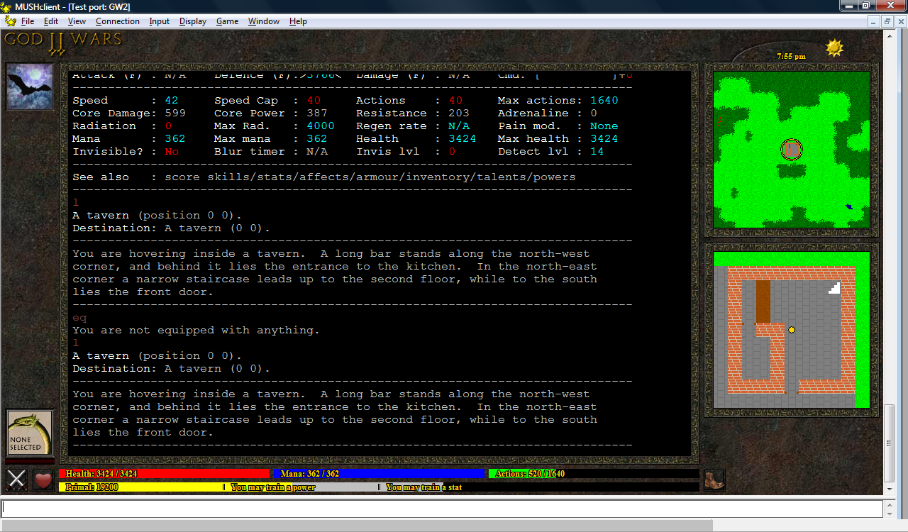
(click image to enlarge)
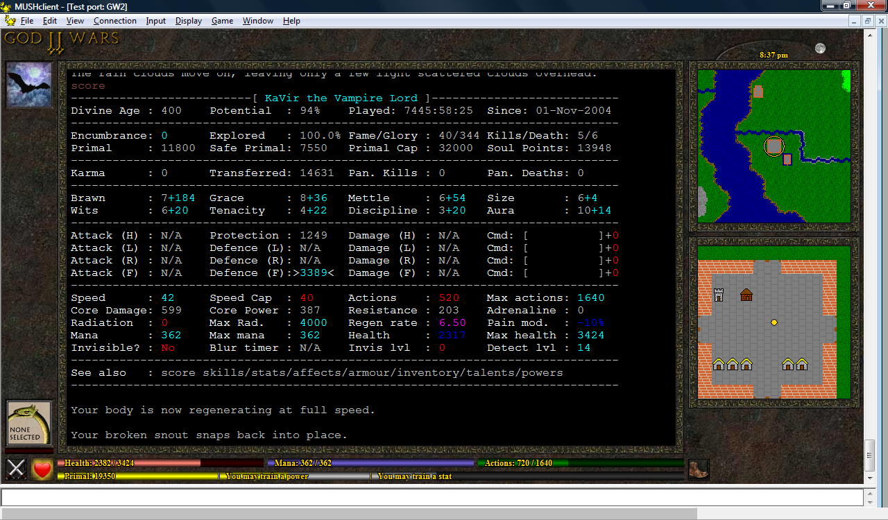
And another with paler bars:
(click image to enlarge)
Here they are again, just the bars this time:
(click image to enlarge)
I'm also toying with a red that fits better with the slateblue - firebrick is quite nice, but perhaps a bit dark? I also used forestgreen instead of green, as it's a fraction less harsh.
(click image to enlarge)
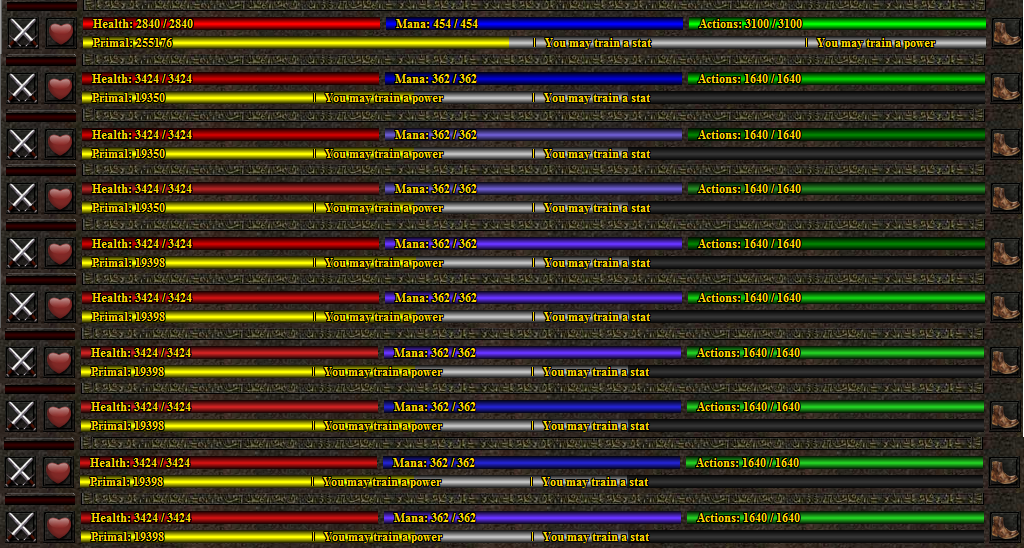
Here are a selection of slightly different shades of bar I tried:
In the end I settled for the last one. So, back to the plugin again...
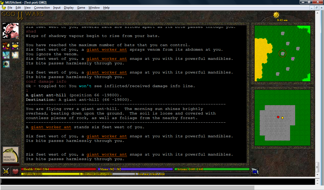
I'm now using the new energy bar colours, and they're pretty nice. While playing with them I noticed that the bars were off by 1 pixel - that is, they had 2 "bright" pixels in the middle despite being an odd number of pixels high, so they got a bit darker at the top than than at the bottom. I tried changing them to have 1 bright pixel in the centre, but they didn't look as good, so in the end I changed them to 3 bright pixels (which required manually drawing an extra line in the middle). A lot of work for something most people probably wouldn't notice, but once I'd seen it I felt compelled to fix it. Did the same for the enemy avatar's energy bar, even though it's thinner - once again it looked a bit iffy with just 1 bright pixel in the centre.
Based on a suggestion from Alayla, I've also added a (1 pixel wide) black line at the left and right end of each bar.
Alayla has provided some new movement icons - a pouncing boot, a retreating boot, a wing (for hovering, flying and swooping) and a fin (for swimming). In combination with the coloured text, this provides full coverage for all the different movement speeds.
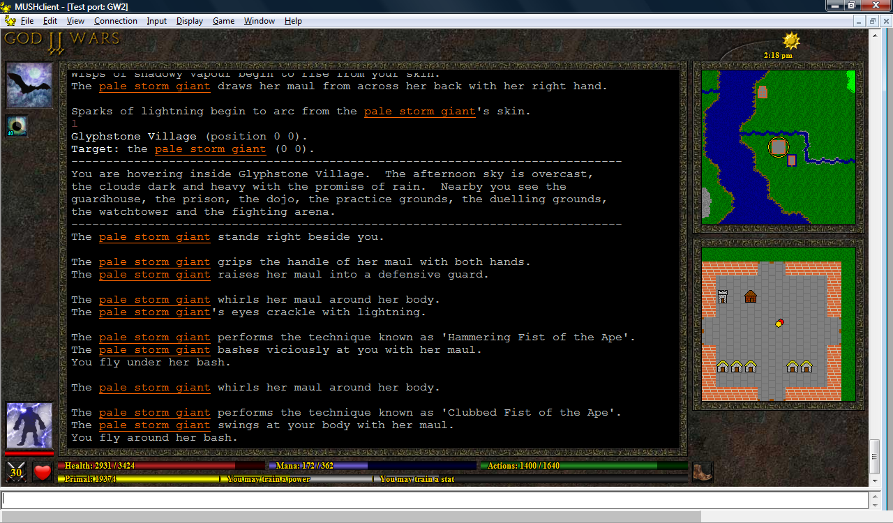
I've left the pie-shaped timers for now, as I think they're a fairly good way to see at a glance which spells are soon to expire - but I still plan to do more work on them. Their brightness now only changes when the duration drops below 60 seconds.
(click image to enlarge)
No comments:
Post a Comment