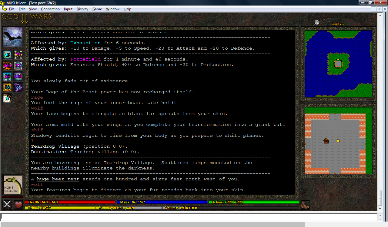
I'm considering reducing the size of the duration text, so it doesn't block too much of the spell images, but I'm worried about making it too small to read...it's a difficult balance between cosmetics and functionality.
(click image to enlarge)
I've also been playing around with the size and position of the duration text on the spell icons:
Still undecided. I quite like the bottom-right one (the four icons with the size 6 font in the bottom-left corner of each icon) from a stylistic perspective, as it doesn't hide much of the icon, but it really is small.

No comments:
Post a Comment