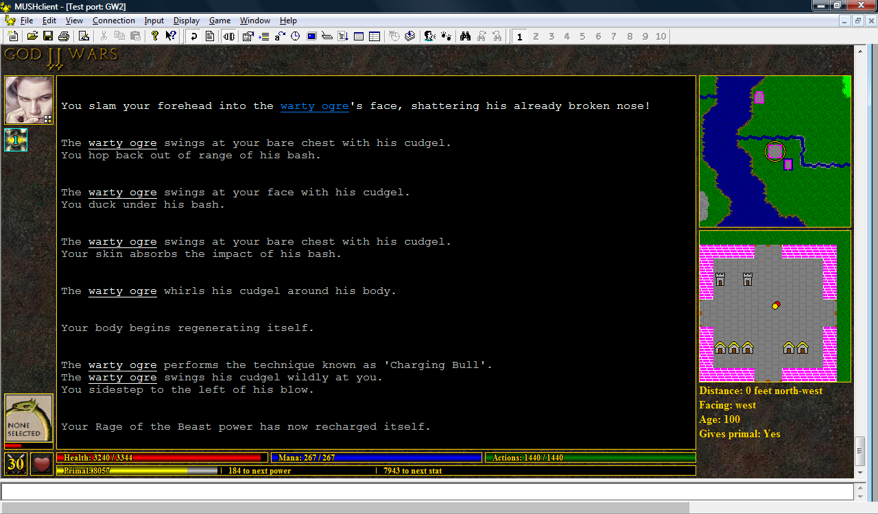
I had considered using the right side to display a list of avatars for all creatures within your line of sight, each with its own little health bar, in which case your target's avatar could simply be enlarged. But your current target is far more important, so I don't think it's a problem separating it from the others.
Another option would be to put it under the player's avatar (top left), but that would interfere with the spell icons, unless there was always an avatar (i.e., a blank one if you're not fighting anyone).
One player also suggested putting the avatar above the text window, but I think that would look a bit odd, and there's not much space (unless the avatar were made smaller). The original plan was to use that space for tabs, but I think that'll be a long-term project...however I may put some general purpose buttons there instead.
(click image to enlarge)
No comments:
Post a Comment