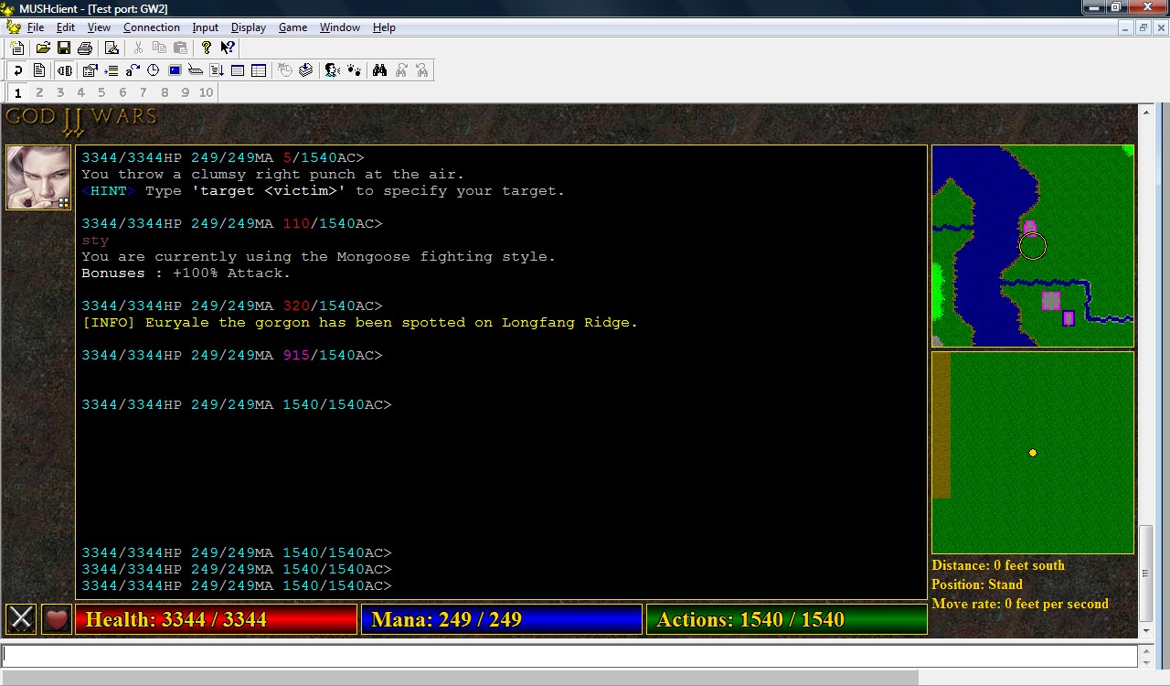
I've been playing around with a new layout. The width of the left side has been extended from 50 pixels to 80, leaving the correct amount of space for two 32x32 icons - which includes new adrenaline and regen icons. I've also dropped the title bar down from the left side, as I plan to use the space for spell affect icons. The avatar has been enlarged and moved to the top left, below the new title. The space above the text window will probably be used for tabs, while the space above the map will have a moving sun icon indicating the time of day (pretty important in GW2, as different mobs spawn during the day and night).
Problem is the energy bars are no longer the same height as the icons, making the layout appear poorly aligned. I tried enlarging the energy bars, but I think that makes them look too big:
(click image to enlarge)
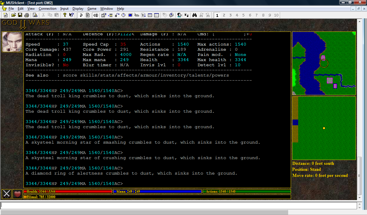
So instead I tried adding a primal (experience point) bar below the energy bars, and I think I prefer that:
(click image to enlarge)
No comments:
Post a Comment