The energy bar under your opponent on the left is now a salmon colour rather than red if the opponent is too weak to give a reward for killing it. There's also mouseover information telling you what age they are - so that covers at least some of the text. I'm trying to decide whether the other information is really vital, and if so, where it should go - perhaps more icons beside the boot? I also considered resizing the energy bars so that the boot could go below the text window (but then I'd have to do the same with the heart icon...and perhaps the crossed swords? Then I'd need to rearrange the enemy avatar...)
One of my admin has provided a large number of new avatars. She also mentioned that the spell affect icons looked out of place - so after some consideration I've decided to remove the borders around them. I wasn't sure about it at first, but after using it for a bit I think it looks better, now that the borders have been removed from everywhere else.
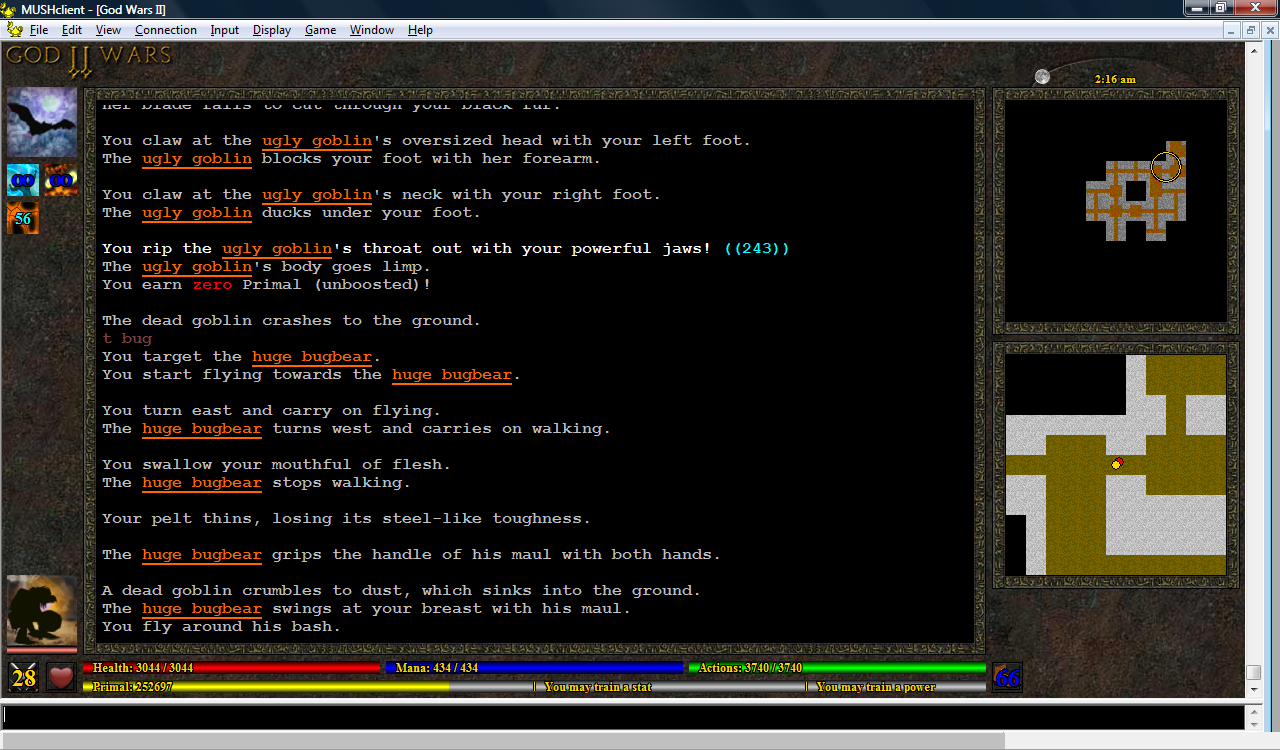
I've also cleaned up the sun/moon icon in the top right, which would vanish for several minutes at a time. It now always shows at least one pixel on one side or the other, and completes its cycle from left to right at midnight.
I'm still trying to decide what to do at the top. I'd originally thought of having bottons or tabs, but I wonder if that might look too cluttered. Most custom clients seem to have the title of the mud in a big fancy font at the top, and I always felt that was a waste of useful screen space, but I do wonder if it might look better for screenshots (which of course would help with advertising).
(click image to enlarge)
No comments:
Post a Comment