Thursday 11 November 2010

MUSHclient GUI: 11-Nov-2010

I've been aware for a while that the maps can look a bit tile-ish, because of the simple fact that they repeat the same tile over and over - but it looks particularly bad on the full map (as you can see on the previous screenshot).  Part of that was because I'd just halved the height and width of the normal tiles using Paint, so I got the mud to properly generate smaller tiles - however it still didn't look that great.

So I tried creating two of each tile set and alternating between them - it was better, but still not that good.  Randomising them was a bit better still, but looked wierd when you moved around, as the whole landscape seemed to shake.

In the end I settled on five of each tile set, with the plugin selecting one psuedo-randomly each time it draws a tile, and I think the maps look quite a lot better.

(click image to enlarge)

Wednesday 10 November 2010

MUSHclient GUI: 10-Nov-2010

I decided to have a go at creating a full map of the current world, which for now can be opened and closed by clicking on your avatar (just so that I could test it).  It'll probably be opened by some sort of magnifying glass button on the border of the top minimap, but I've not yet decided how best to do it.

For the time being, the map only works for the Realm plane (the newbie world), and the index values are hardcoded into the plugin.  For the Nexus (which is 9 times as large) I'm going to need much smaller tiles, and I'd rather not reveal it all up front - so I may have it reveal the map as you move around, and save the data between sessions.

(click image to enlarge)

Thursday 4 November 2010

SlothMUD-themed GUI

After chatting with Splork, I decided to have a go at creating a SlothMUD-themed GUI, to see how easily the plugin could be adapted.  It took around 2-3 hours in total (although I was watching TV and chatting online at the same time) - most of it was done in about half an hour, with the rest of the time spent tweaking the layout, troubleshooting a couple of problems carried over from my plugin, playing around with colours, and removing a load of unused code.

The graphics are from the SlothMUD website, giving the GUI a similar theme, with the layout designed to be similar to their flash client.  For comparison purposes, the SlothMUD website is available here: http://www.slothmud.org/


(click image to enlarge)

In practice I think a smaller title would work better, but this was just a quick experiment, and I didn't want to spend too much time on it.  Many muds already have a graphical title, a background texture and borders on their website, and my intent was just to see how easily such images could be used to create a themed GUI.

The map would need to be done differently (because of the room-based thing), but I have some ideas for that, which I may implement if there's interest (it'd be great for a generic plugin, as most muds are room-based).

Monday 1 November 2010

MUSHclient GUI: 30-Oct-2010

Finally got the hotkeys working.  There's a 'hotkey' command in the mud that allows you to specify a label and action for each hotkey, and you can either press the buttons or use the function keys on your keyboard.  Because they're configured within the mud, you can specify different actions for each character - so your mage can have spells, your wolf can have pounce and claw attacks, etc.

I also reduced the size of the energy bars on the mini-avatars, allowing up to 3 rows of avatars to be displayed.  They don't quite align up (they're off by a couple of pixels) but you don't really notice unless you zoom in.  One thing I really need to add is a way to recognise your own pets, particularly for the up-coming Lich class, which will depend heavily on undead servants.

Finally, the maps now refresh properly for all locations.  Previously they didn't show anything when inside the dojo, practice grounds, or various other buildings.

(click image to enlarge)

MUSHclient GUI: 19-Oct-2010

Following feedback from Bobo the bee on MudBytes, I've added a blur timer (an eye icon - I'm not happy with it but it'll serve until I can find something better).  I've also tried moving the boot icon to the left, as this gives me more space under the map for drawing mini-avatars:


(click image to enlarge)

I'm wondering about putting the large enemy avatar on the right, beside the mini-avatars (so that targeting someone would effectively just increase the size of their avatar).  I think I'd find it harder to monitor their health that way though.

MUSHclient GUI: 16-Oct-2010

I decided to have a go at adding the mini avatars below the zoomed map, as I mentioned earlier.  I'm a bit short on space, but I can fit seven of them side-by-side (although if there are seven, the last one sticks out two pixels further than the map).  I was nearly able to fit in two rows, but not with the energy bars, and using the pie-shaped timer doesn't seem to fit.  Other options would be to remove the boot icon, or put the additional avatars beside it - but I can't think of a better place for the boot, and I'm thinking of adding more icons beside it anyway.

So it looks like I'll be limited to seven mini avatars.  But as it shows the seven closest things, that's probably okay - I don't generally have a lot of things in one place, and you could always click on the map to move closer (and thus change which avatars are displayed).  The only real exception would be in the starting village, where there are already seven buildings, and where players tend to pass through or sometimes even hang around.

You can click on the mini avatars to target the appropriate thing, but there's no other way to tell which is which.  One option might be to use a range of different colours for each dot on the map, and use the same colours for the energy bars - that would allow the user to distinguish between mobs at a glance.  But I wouldn't like it from a consistency perspective.

(click image to enlarge)

MUSHclient GUI: 13-Oct-2010

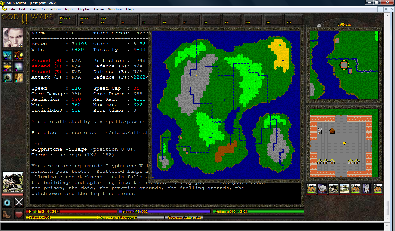
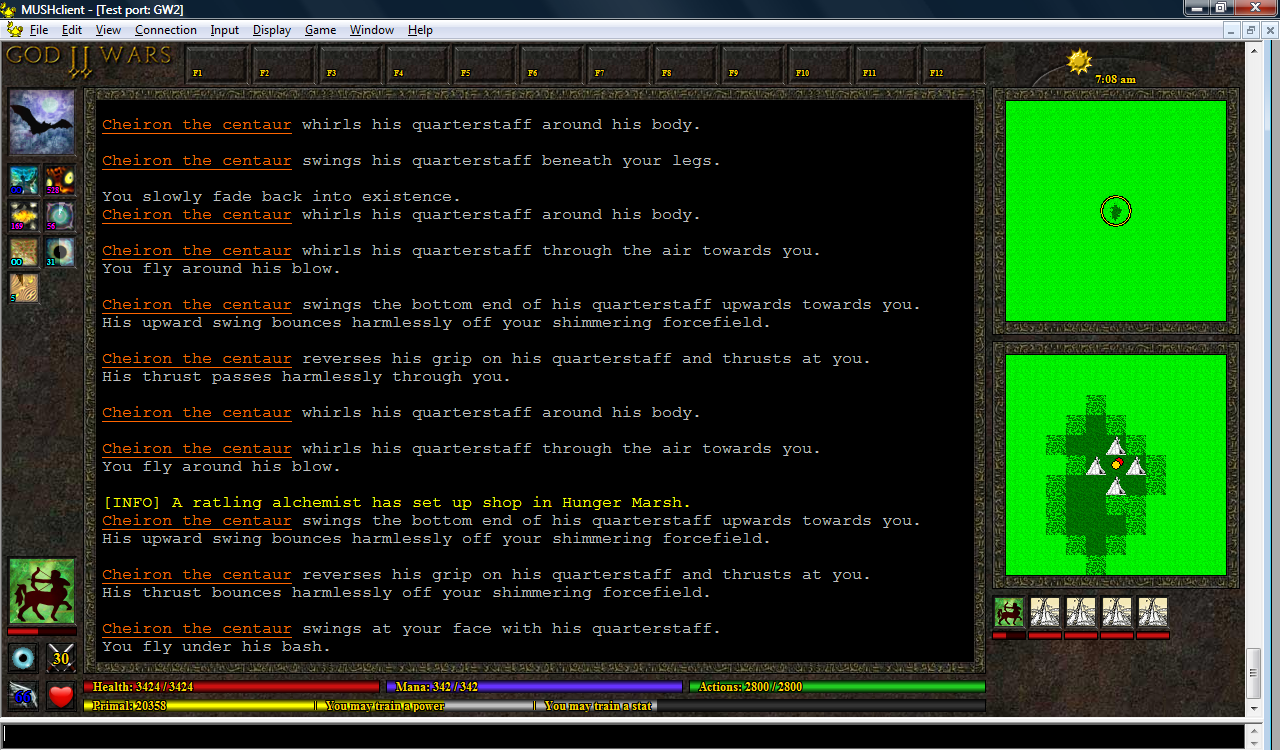
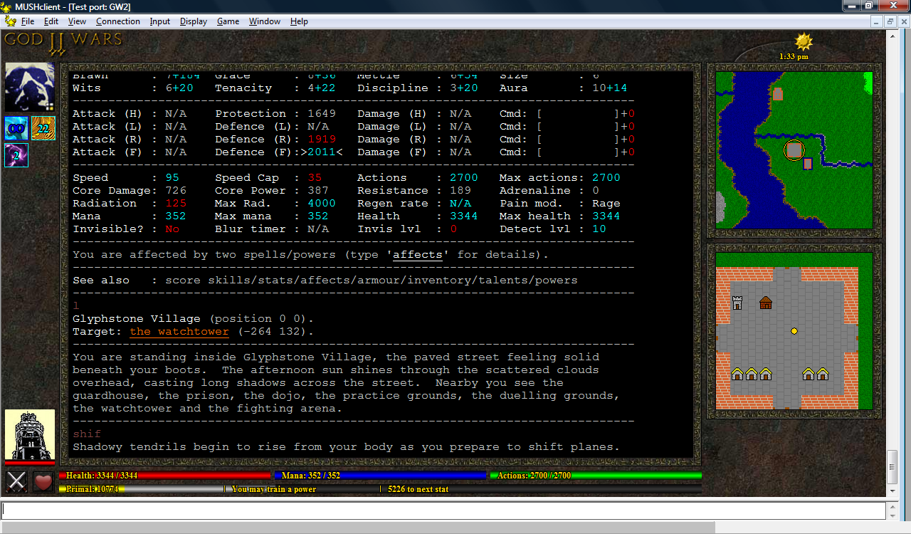
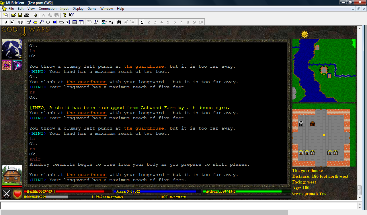
I decided to have a play with buttons.  I'd originally thought about putting them at the top, but long ago dismissed it as a wierd place to have buttons - however last night I got thinking about tying them to the function keys, and also making them available as hotkeys.  Not only does this fill the space at the top of the interface, it's also quite a logical place if they're bound to function keys.

This is my initial draft, just to get the ball rolling:

(click image to enlarge)

The idea is that players will be able to define what F1 to F12 do within the mud, and this information will be passed to the plugin, which will then configure the function keys.  So you might define F1 as 'rage' and F2 as 'magic', and the mud would then send these values to the plugin, which would display 'Rage' and 'Magic' on the respective buttons (or perhaps add a little icon, I've not yet decided).  You could then either click the button with your mouse, or press the function key on your keyboard.

It might also be cool if you could right-click the button to bring up a little window for configuring what the button does.  This data would then be sent to the mud, which would confirm that it was valid, and then tell the plugin what to set - this might seem a bit of a roundabout approach, but I think it would be the easiest to implement.  However I'm not sure if you'd be able to have an input field in the miniwindow...but what might work is to have it bring up a large menu of possible commands, rather like Guild Wars, and let the user click (or even drag-and-drop) which options they want on their buttons.

The hotkeys can be set with the Accelerator function (which, I discovered, can also be bound to a range of other keys - this could perhaps allow you to emulate character mode enough to create a graphical Roguelike interface).  I also discovered that Accelerator allows you to send negotiation sequences, although sadly these still get echoed to your screen (as junk characters), and I don't know how to avoid this without switching off input echo completely from within the MUSHclient settings.

Another minor issue is that hitting F1 attempts to bring up the Windows help, even if you've bound F1 to something else.  You can get around this by toggling an option in the preferences, but I don't know if it can be done from within the plugin.

From a cosmetic perspective, it seems a bit strange to have the "F1"/etc text label displayed in the bottom left corner of the button.  I feel that it should be in the top left.  But that looks a bit strange when compared to the spell icons.  On the other hand, if I decide to include an icon on each button as well, perhaps the text could be made bigger and placed in the centre left.

There's also the issue of button width.  Like the energy bars, the buttons are aligned with the text window - which means their width can vary.  This was easy enough to do for the energy bars, but it's going to be more fiddly for the buttons, particularly if they contain text and images.

I've also not yet given up hope on having some tabs (for things like a full-world map, an equipment and inventory list, etc), but if I still want these at the top I'll have to make the buttons smaller.  They could instead be placed at the right side of the window though.

MUSHclient GUI: 02-Oct-2010

Donky on MudBytes suggested that he didn't like energy bars that were both candy coloured and gradients, so I created a screenshot without gradients on the bottom energy bars:

(click image to enlarge)

And another with paler bars:

(click image to enlarge)

Here they are again, just the bars this time:

(click image to enlarge)

I'm also toying with a red that fits better with the slateblue - firebrick is quite nice, but perhaps a bit dark?  I also used forestgreen instead of green, as it's a fraction less harsh.

(click image to enlarge)

Here are a selection of slightly different shades of bar I tried:


In the end I settled for the last one.  So, back to the plugin again...

I'm now using the new energy bar colours, and they're pretty nice.  While playing with them I noticed that the bars were off by 1 pixel - that is, they had 2 "bright" pixels in the middle despite being an odd number of pixels high, so they got a bit darker at the top than than at the bottom.  I tried changing them to have 1 bright pixel in the centre, but they didn't look as good, so in the end I changed them to 3 bright pixels (which required manually drawing an extra line in the middle).  A lot of work for something most people probably wouldn't notice, but once I'd seen it I felt compelled to fix it.  Did the same for the enemy avatar's energy bar, even though it's thinner - once again it looked a bit iffy with just 1 bright pixel in the centre.

Based on a suggestion from Alayla, I've also added a (1 pixel wide) black line at the left and right end of each bar.

Alayla has provided some new movement icons - a pouncing boot, a retreating boot, a wing (for hovering, flying and swooping) and a fin (for swimming).  In combination with the coloured text, this provides full coverage for all the different movement speeds.

I've left the pie-shaped timers for now, as I think they're a fairly good way to see at a glance which spells are soon to expire - but I still plan to do more work on them.  Their brightness now only changes when the duration drops below 60 seconds.

(click image to enlarge)

MUSHclient GUI: 30-Sep-2010

I decided to try with the bottom right option for the icons, based on feedback, and see what it was like in play.  The text really is pretty small, but it's usable - I've still not made my mind up about it.

Last year Nick Gammon showed how to create cooldown buttons in MUSHclient, and I've kept meaning to try it out - so today I did, adding expanding pie-shaped shading around the spell icons to show their last 60 seconds of duration (it could easily be extended to show the true percentage, but I didn't want to change the format of the MSDP variable just to test something out).  I'm not entirely happy with the results, but perhaps it would look better if I adjusted the lighting.

(click image to enlarge)

MUSHclient GUI: 29-Sep-2010

Alayla has provided a smaller set of spell affect icons (28x28 rather than the previous 32x32) and some 34x34 backgrounds for them.  Although this does mean that the affect icons are closer to each other than all the other icons, I still think it looks good - it acually makes them look more like a coherent block.

I'm considering reducing the size of the duration text, so it doesn't block too much of the spell images, but I'm worried about making it too small to read...it's a difficult balance between cosmetics and functionality.

(click image to enlarge)

I've also been playing around with the size and position of the duration text on the spell icons:


Still undecided.  I quite like the bottom-right one (the four icons with the size 6 font in the bottom-left corner of each icon) from a stylistic perspective, as it doesn't hide much of the icon, but it really is small.

MUSHclient GUI: 26-Sep-2010

Standardised the size of the font for the boot and crossed swords icons, as suggested by Kline.  There are now four different boot icons to indicate different movement speeds.

Alayla (one of my admin, and the person responsible for most of the graphics) pointed out that the avatars were a bit blurry - turns out I had them enlarged to 70x70, even though most of them are 64x64 images.  Shrinking the avatars to their "proper" size would have messed up their alignment with the icons though, so Alayla created a background for the avatars.  They're now a bit smaller, but I think I prefer them with the background, it makes them look sunken into the display.

Still not entirely happy with the spell icons.  They could really do with a border as well, but I'm not sure how to do that without needing to realign everything else.  Perhaps add the border directly to the icons, to make them more like the crossed swords, heart and boot?

(click image to enlarge)

MUSHclient GUI: 25-Sep-2010

I've decided I definitely prefer it without the text in the bottom right.  I've added a little boot icon beside the actions bar to indicate your movement speed (you can't see the boot so well in this image because the movement speed is written over the top, but when you're standing still there's no text, so people shouldn't have trouble recognising what it is).  The text shows your movement in feet per second, and is colour-coded to indicate the movement type (retreat, walk, jog, run or pounce).

The energy bar under your opponent on the left is now a salmon colour rather than red if the opponent is too weak to give a reward for killing it.  There's also mouseover information telling you what age they are - so that covers at least some of the text.  I'm trying to decide whether the other information is really vital, and if so, where it should go - perhaps more icons beside the boot?  I also considered resizing the energy bars so that the boot could go below the text window (but then I'd have to do the same with the heart icon...and perhaps the crossed swords?  Then I'd need to rearrange the enemy avatar...)

One of my admin has provided a large number of new avatars.  She also mentioned that the spell affect icons looked out of place - so after some consideration I've decided to remove the borders around them.  I wasn't sure about it at first, but after using it for a bit I think it looks better, now that the borders have been removed from everywhere else.

I've also cleaned up the sun/moon icon in the top right, which would vanish for several minutes at a time.  It now always shows at least one pixel on one side or the other, and completes its cycle from left to right at midnight.

I'm still trying to decide what to do at the top.  I'd originally thought of having bottons or tabs, but I wonder if that might look too cluttered.  Most custom clients seem to have the title of the mud in a big fancy font at the top, and I always felt that was a waste of useful screen space, but I do wonder if it might look better for screenshots (which of course would help with advertising).

(click image to enlarge)

MUSHclient GUI: 24-Sep-2010

I'm still not happy with the text in the bottom right corner, partly because I think it looks out of place with the rest of the GUI, and partly because it provides information about your target - which is displayed on the left side.  I've been wondering if perhaps I could display the same information using little icons, displayed above or below the target icon.

The extra space I've freed up on the right means I can now draw borders around the two maps.  I think this looks quite a bit nicer, although the right side now feels rather bare.

One problem is that the maps have a fixed size.  Perhaps they could be resized, but I'm not sure how good they would look if I did that.  But if they have a fixed size, I can't properly align them with the text window - otherwise I could just do that and perhaps add some extra icons underneath.

(click image to enlarge)

MUSHclient GUI: 29-Aug-2010

I've just been having a play with an online photo to cartoon convertor, and in my opinion the results are actually pretty good:


This could prove to be the solution to my avatar problem - because while I suck at drawing and painting, I'm not bad at photography, and most of my family are pretty keen photographers as well.  It also seems to be much easier to find public domain photographs than hand-drawn artwork.

But back to the plugin...

Finally got the sunrise working (using the actual time - previously it was just using a dummy counter for drawing purposes).  The original plan was that there would be a sun going from left to right during the day, and a moon at night - but this proved very fiddly, because days vary in length throughout the year.  So in the end I decided just to have a full cycle (from left to right) represent a 24 hour period, from midnight to midnight, with the moon turning into a sun during the day and back to a moon at night.  I also added the current time as a text label.

I've been creating more avatars from photos as well.  Some work better than others, but I definitely think the cartoons fit the GUI better than photos.  If other people decide to create their own GUIs, this would be a great way to built up a shared repository of images.

(click image to enlarge)

MUSHclient GUI: 28-Aug-2010

I decided to see what it would look like if I put a pretty border around the text window.  I quite liked it, but it looked strange with the gold lines, so I removed them all.  It makes the interface look darker, and I wasn't sure about it at first, but it's growing on me.

Without the gold borders, the energy bars looked wierd - just black rectangles.  So I've tried putting darker coloured bars behind them rather than just leaving them blank.

I've also been adding more avatars.  It's hard to find free hand-drawn images, but there are quite a few public domain photographs - I'm worried it may look inconsistent to mix the two, but I've decided to give it a go anyway, as I desparately need more images (the building avatar in this screenshot is a photograph).  I also want to investigate using photoshop (or some other tool) to make the photographs appear like drawings.

(click image to enlarge)

MUSHclient GUI: 07-Aug-2010

I've changed the plugin to use a Lua table instead of GetVariable and SetVariable, and made it more robust in regard to missing images.  The mud now sends icon IDs, so that each spell is displayed using a different icon, and I've started working on a "time of day" icon - a moving sun in the top right corner.  I'm planning to have a moon as well, to indicate the time of night.

Mobs can now have their own icons, although I don't yet have many images to choose from.  I may have to call on players to help provide some...this is the sort of thing that would be great to share between muds - a common repository of monster images.

(click image to enlarge)

MUSHclient GUI: 17-Jul-2010

I'm playing around with enemy information right now.  I noticed it's much easier to keep an eye on your opponent's health if the information is displayed in the bottom left.  The downside is that that separates it from other target information such as distance and direction (currently in the bottom right), and that's not so easily packed into such a small space.

I had considered using the right side to display a list of avatars for all creatures within your line of sight, each with its own little health bar, in which case your target's avatar could simply be enlarged.  But your current target is far more important, so I don't think it's a problem separating it from the others.

Another option would be to put it under the player's avatar (top left), but that would interfere with the spell icons, unless there was always an avatar (i.e., a blank one if you're not fighting anyone).

One player also suggested putting the avatar above the text window, but I think that would look a bit odd, and there's not much space (unless the avatar were made smaller).  The original plan was to use that space for tabs, but I think that'll be a long-term project...however I may put some general purpose buttons there instead.

(click image to enlarge)

MUSHclient GUI: 14-Jul-2010

Finally got the spell icons working.  The infinity symbol was a bit tricky - I had to overlap two letter Os, taking into account their black outlines.  The server is currently still sending the same icon for every spell, but the plugin will display whichever icon is specified.

(click image to enlarge)

MUSHclient GUI: 12-Jul-2010

I've been busy with other things recently, but one of my players has been working on his own plugin, and he sent me his building icons for the zoomed (bottom) map - so I thought I'd see what they looked like.  His maps are smaller than mine (10x10 pixel tiles instead of 20x20), so I had to enlarge them and tweak them a bit, but I think they look pretty good (compare with the screenshot in post #9)- it makes me wonder if it would be viable to have better creature icons as well?  I'm undecided...but I think the map would really need to be bigger for that to work.

(click image to enlarge)

MUSHclient GUI: 07-Jul-2010

I've decided I like the second primal bar, but I've changed it to a duel-colour bar to differentiate between regular primal and safe primal (the latter is earned from quests and such, and cannot be stolen from PK).  The safe primal is spent first, and is the silver part of the bar.  The primal bar now also includes markers indicating how much is needed to train a power or stat.

Also started experimenting with the spell affect icons, which appear below your avatar.  These will eventually include timers and mouseover information.


(click image to enlarge)

MUSHclient GUI: 05-Jul-2010

I've been playing around with a new layout.  The width of the left side has been extended from 50 pixels to 80, leaving the correct amount of space for two 32x32 icons - which includes new adrenaline and regen icons.  I've also dropped the title bar down from the left side, as I plan to use the space for spell affect icons.  The avatar has been enlarged and moved to the top left, below the new title.  The space above the text window will probably be used for tabs, while the space above the map will have a moving sun icon indicating the time of day (pretty important in GW2, as different mobs spawn during the day and night).

Problem is the energy bars are no longer the same height as the icons, making the layout appear poorly aligned.  I tried enlarging the energy bars, but I think that makes them look too big:


(click image to enlarge)

So instead I tried adding a primal (experience point) bar below the energy bars, and I think I prefer that:


(click image to enlarge)

MUSHclient GUI: 26-Jun-2010

Tied the avatars to shapechanging, so that they automatically change to reflect your current form.  Added a heart icon to indicate your regen rate (empty, half, full).  The plugin now reports its version number to the mud, making it easier to track which version players are using.

(click image to enlarge)

MUSHclient GUI: 25-Jun-2010

Added support for xterm 256 colours, improved the way tiles are revealed as you move around, and added buttons to the maps which can be clicked to move in the specified direction - hovering over the button will indicate what it does.


(click image to enlarge)

Then went on to add a little avatar in the bottom left corner, and changed the circle in the top map to indicate your exact position instead of just your tile, so that it moves gradually instead of jumping 20 pixels at a time.

(click image to enlarge)

Finally, I added an adrenaline timer below the avatar, and drew a black outline around the text on the energy bars to make it easier to read.  At this point I decided to scrap the arrow buttons - instead, you can simply click on either the top or bottom map to move to the location you clicked.

(click image to enlarge)

MUSHclient GUI: 24-Jun-2010

Took a break from the plugin to work on the mud, but now I'm back!  Created a new set of dungeon tiles.  As the dungeon map fits exactly into the top map window there's no point in having it scroll around - so instead, the circle moves around while the map remains in place.

(click image to enlarge)

MUSHclient GUI: 14-Jun-2010

Added MXP links to creature names, so that you can target creatures by clicking on their name.

(click image to enlarge)

MUSHclient GUI: 25-May-2010

Modified the tiles to make them a bit less blocky at the edges.  It's not ideal by a long stretch, but I think it looks a bit better this way.

(click image to enlarge)

MUSHclient GUI: 24-May-2010

Redesigned the energy bars to be positioned exactly under the text window, and included labels indicating what they represent along with the current numeric values.  Changed the target info font to something less fancy but easier to read.

(click image to enlarge)

MUSHclient GUI: 15-May-2010

Added information about your current target.

(click image to enlarge)

MUSHclient GUI: 13-May-2010

Decided I preferred the energy bars at the bottom after all, so scrapped the other ones.  Added a "look" scale map underneath the other map, showing mobs, objects, players and buildings.

(click image to enlarge)

MUSHclient GUI: 12-May-2010

Enlarged the tiles from 10x10 pixels to 20x20, with some randomisation of the colours to create a more textured appearance.  Drew a circle in the centre of the map to represent your current position.

(click image to enlarge)

MUSHclient GUI: 10-May-2010

Created a little map in the top right corner, assembled from 11x11 tiles.  The tile set is generated by the mud from the current internal world data, using an admin command.

(click image to enlarge)

MUSHclient GUI: 07-May-2010

Considered putting a title bar image across the top, but in the end I decided it was better with a taller text window.  Added the title bar down the left side instead, and resized the text window accordingly.

(click image to enlarge)

MUSHclient GUI: 06-May-2010

After lots of reading, and some help from Nick Gammon on the MUSHclient forums, I manage to create my first simple graphical plugin - it reduces the size of the text window and adds a textured background.

(click image to enlarge)

MUSHclient GUI: 30-Apr-2010

I feel like a newbie again! However after a couple of weeks experimentation I manage to modify Nick Gammon's experience bar plugin so that it uses MSDP instead of the prompt, and draws three energy bars instead of one, representing health, mana and actions.

(click image to enlarge)

Introduction

I'm going to be using this blog to discuss MUD design issues related specifically to God Wars II, but which I feel may also be of interest to other developers. I use MudLab for more general discussions, but I don't want to turn that into a load of "my game does this" posts.

My main reason for creating this blog is to record my experiences creating a custom GUI for MUSHclient. I've already been posting the information on MudBytes, but I think a blog would be a more effective way of managing the comments from other users - the MudBytes thread is getting a bit cluttered and difficult to navigate.

A graphical interface is something I've wanted for God Wars II for quite a while, although I've always tended to dismiss it as something outside my area of expertise. On 30th June 2009 I even made some early inquiries into creating a simple GUI for MUSHclient, but I never really took it any further. It wasn't until a couple of posts on MudBytes that I finally got the ball rolling.

The first was on 15th March 2010, when donky asked if I could detect which clients my players used. Prior to that point I'd never really looked into telnet negotiation (shameful I know!), but once I'd started playing with it I suddenly realised just how easy and useful it is.

The second was on 6th April 2010, when Scandum recommended that I add support for MSDP. At the time it was only intended for one of my players who wanted it for his TinTin++ scripts, but once I'd added it, I realised that it did exactly what I'd wanted to do with MUSHclient - and by 17th April I'd managed to create a basic MSDP plugin for MUSHclient.

By the end of April 2010 I had implemented MSDP and had created my first GUI - only simple energy bars, admittedly, but six weeks earlier I didn't understand how telnet negotiation worked, I'd never programmed in Lua, and I'd never written a client plugin.

In other words: This ain't rocket science. It might appear intimidating at first, but MUSHclient does all the hard work for you - all you need to do is provide it with the images, pass it the data, and tell it what and where to draw. Some of my players have already designed their own plugins, and another mud developer mentioned that he was able to create a basic GUI for his own mud in only a few hours, using mine as a template.

On that note, I should also mention that while you're welcome to copy and adapt my plugin for your own muds, I would ask you not to redistribute the images. I have collected a selection of public domain avatars which you can download here, along with some links for obtaining or creating more, but most of the graphics used by my plugin were created specifically for God Wars II by Alayla, or have other licencing restrictions.